Original Image
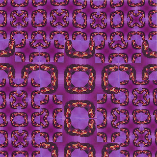
1st kaleidoscope
2nd kaleidoscope
3rd kaleidoscope
Out of all three kaleidoscopes my favorite is the second because of the color. I think the rainbow gradient makes the picture come alive. Also, I feel like the triangle in the middle makes the picture look trippy. I feel like the last kaleidoscope could be improved because it is very simple and it has a dull color. Its basically a whole bunch of black squares. The easiest part of this art work was choosing what original picture I wanted to start with.
I used the magnetic lasso tool to cut the picture into fours and make the basic foundation. I really just kept copying to make the image smaller to break it down. The more I copied the cooler the image looked. I also used a ruler to make sure everything was symmetric and equally set out.
The hardest part of this art project was trying to make three different kaleidoscopes. I ran out of ideas after my first kaleidoscope. I feel like they all look similar but just different colors. The first kaleidoscope is a pinkish purple, the second kaleidoscope scope is a vibrant rainbow color and the third kaleidoscope is black and white.
If I could do this project over I would choose a picture that didn't have a person in it because I feel like it is easy to tell what I originally started off with. If I used a picture of nature or maybe even a animal it would look more unique and interesting. On a scale of 1 to 10, 10 being the best I would rate my effort a 10. I took a lot of time on each if my kaleidoscope . Each kaleidoscope took me two classes, I put a lot of thought into it. I could of easily finished all three kaleidoscopes in one class period but they would of been poorly put together. I demonstrated the goal of this project by creating three different kaleidoscope using the same original picture just different colors and patterns.


