Wednesday, June 7, 2017


The strongest piece of my art is my blending. I used the mixer brush to blend my colors to make it look like a real painting. The mixer brush really helped me to make my project look realistic. One piece of my art that could be improved is the eyebrows, I feel like I made the eyebrows look really skinny. I got too carried away on the mixing when it came to the nose.
The tools I sued were the paint brush, eye dropper, layer masks and mixer brush tool. I used the paint brush to sketch over the actual image for any change of colors. I used the eye dropper to get the exact color that was on the original image. I used two layer masks one for drawing and another for painting.  
The easy part about this project was choosing the picture. I recently just took that photo of my niece and really loved. The difficult part of the project was keeping a steady hand when painting and drawing the outlines of the image.

I demonstrated the objective by using to using the paint brush tool, eye dropper, and mixer brush tool to execute my painting accurately.  My colors are blended well; there are shadows, highlights, and a high level of detail. If I could do this project again I would paint a picture that I drew instead of using a picture that I took on my phone. On a scale of 1 to 10 I would rate myself a 10 because I really tied hard on this project. I think this project took me the longest to complete. I tried my best to really make the picture look realistic. 

Friday, May 19, 2017


Hybrid Animal
     The strongest piece of my work is the mixture of my three animals. I started off with a bird and then I added a dog ear on its head, I like it because it doesn't really look like a dog ear so it’s sort of a guessing game. Then, I added an elephant trunk on top of the bird’s beak. I like that part because when I changed the color to a light red it almost looked real. Lastly, I added a fish tail and changed the color to a mixture of blue and yellow. I like the animals I choose because they're all really different. For instance a fish lives in water and an elephant lives in the wild. The realness of my project can be improved. I could improve this by blending more or changing the colors of the added on animals to match the actual bird. I feel like my idea of the animals I choose was good but it doesn't look like a real animal.
     To create my work I used the layer mask and clone stamp to seamlessly create a hybrid creature out of 3 or more animals. I added my three pictures of the animal I wanted to mix, it was important that I choose pictures that was very large that way when I went to combine them it wouldn't look very blurry. Next, I positioned the animal and lowered the opacity so I could see through and make sure the animal was where I wanted it and upped the opacity back up. Then I applied a layer mask, a black paint brush and erased all the parts of the animal I didn’t want. For instance, I erased the entire fish expect for the tail because that was the only part I wanted.
    The easiest part about this project was choosing the animals, I feel like I love animals so I had a lot of options. I didn't really have to think about three animals, it came to me quickly. The difficult part about this project was getting it to look real. I had a hard time finding pictures that all faced sideways, I couldn't use a picture of a dog that was facing front on a sideways bird. Also, choosing the color to match the bird was hard because it was more than one color.
I demonstrated the objective of this project by using the layer mask and clone stamp to seamlessly create a hybrid creature out of 3 or more animals. The goal of the project was to mix three animals together, which I did, a bird, dog ear, fish tail and elephant trunk. If I could do this project again I would start off with a panda instead of a bird. I wish I could do this project several times because there's so many animals so the possibilities are endless. On a scale of 1-10, 10 being the highest I'd rate my effort a 9 just because I could always try harder. I tried my best to make the hybrid animal look real, although it didn't come out great my effort was still there.


Friday, May 5, 2017


Pop Art!
     The strongest piece of my work are the colors. I used extremely bright colors to make the piece pop. I didn't want to use dark colors because I felt like the end product would of been very boring. I could improve my work by choosing a better picture. I feel like the picture I choose was very basic, just  atypically selfie. After I saw examples of other pop art I waned to change my staring picture. 
     To create my work I used the magic wand to select an area and then I used the brush to paint. I changed the size of my brush so I could paint over with color quickly.
     The easy part about this project was painting over the image. When you make the brush big its really easy to paint. If I kept the brush size small it would of taken forever to paint over one section. The only difficult part about this project choosing different colors that looked well together. For instance if I only used reds and pinks the entire image would of turned black if I made it black and white. I tried to keep the colors different throughout.
     I demonstrated the objective of this work by creating four different pop arts and making a college at the end. I followed the list of directions posted on Ms.Cabral's blog which made the process 10x easier. If I would redo this project I would choose a picture that had two or more people in the project for a cooler effect. On a scale of 1-10, 10 being the best, I would rate myself a 10 based on my effort. I tried really hard to keep the colors different throughout. I keep all of my pop arts open at once so I could make sure I didn't repeat any colors inn the same spot. When I combined all four pictures together it looked really cool and full of life.


Tuesday, April 25, 2017


     The strongest piece of my art is the model. I feel like you can see the excitement and character through her different poses. I think I choose a good environment that allowed the model to try different poses. If you look at the contact sheet you can see her different poses, doing flips and hanging upside off the couch. Overall, it was a fun experience. Although I feel like the quality of the pictures could be better. I could improve this by focusing the camera better before snapping the pictures. I was sort of in a rush because I had dance class and I was already late. I could also improve the quality by using a professional camera instead of an iPhone.
     Tools that I used to create my clone was a layer mask. The layer mask allowed me to draw on the different pictures in different spots. I also used the paint brush with the color back to draw. I also used the ocapicty setting to make the picture look somewhat see through so I could resize the pictures so nothing overlapped.
     The easy part of the clone project was getting my model to do different poses. The model wasn't awkward, I wasn't forcing her to move around and do different things. She was extremely energetic which made the process much easier. I only needed 30 pictures and since the model was so full of life I got even more.The hard part about this project was staying still. In order to avoid your picture from overlapping you have to stay in place. I caught myself moving a little bit and I had to restart over. 
     I demonstrated the objective of this goal by using five different pictures and making a clone. I also demonstrated the objective of this project by not overlapping any pictures and getting a clean cut clone image. If I could do this over again I would choose a different environment. Instead of taking pictures inside I would do it outside in my backyard or a nearby park. I would give myself an eight for my rate of effort because I tried really hard to get energetic photos and stay in place. Overall, I think I did a really good job on demonstrating the objective of this project.

Wednesday, March 15, 2017


Original Image


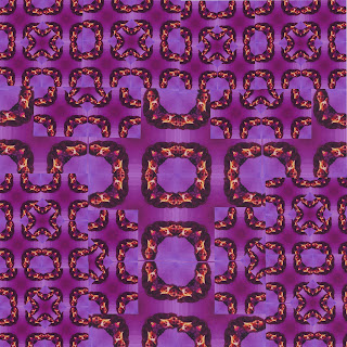
1st kaleidoscope 
 
 
2nd kaleidoscope 
 
 
3rd kaleidoscope 
 
 
Out of all three kaleidoscopes my favorite is the second because of the color. I think the rainbow gradient makes the picture come alive. Also, I feel like the triangle in the middle makes the picture look trippy. I feel like the last kaleidoscope could be improved because it is very simple and it has a dull color. Its basically a whole bunch of black squares. The easiest part of this art work was choosing what original picture I wanted to start with.
     I used the magnetic lasso tool to cut the picture into fours and make the basic foundation. I really just kept copying to make the image smaller to break it down. The more I copied the cooler the image looked. I also used a ruler to make sure everything was symmetric and equally set out.
      The hardest part of this art project was trying to make three different kaleidoscopes. I ran out of ideas after my first kaleidoscope. I feel like they all look similar but just different colors. The first kaleidoscope is a pinkish purple, the second kaleidoscope scope is a vibrant rainbow color and the third kaleidoscope is black and white.
       If I could do this project over I would choose a picture that didn't have a person in it because I feel like it is easy to tell what I originally started off with. If I used a picture of nature or maybe even a animal it would look more unique and interesting. On a scale of 1 to 10, 10 being the best I would rate my effort a 10. I took a lot of time on each if my kaleidoscope . Each kaleidoscope took me two classes, I put a lot of thought into it. I could of easily finished all three kaleidoscopes in one class period but they would of been poorly put together. I demonstrated the goal of this project by creating three different kaleidoscope using the same original picture just different colors and patterns.


Wednesday, February 15, 2017


     The strongest piece of my finished art piece is my background color. Behind my letter is a smooth flowing rainbow it makes my piece vibrant and gives it life. If  choose just one color then it would be somewhat boring. Since I have a variety of color it was okay for me to choose a simple font since the background gives the piece lots of flavor itself. Although that is a weak part of my art piece if i used a complex font my finished at piece would be even more live and upbeat.
     This art piece was not that difficult to create since it was very basic. However the lower case F's were hard to position. I tried my best to space properly from the top to bottom and keep it even. It was easy choosing what letter to work with because F is the first letter of both my first and last name.I felt like it wouldn't make sense to choose any other letter unless it had meaning to keep.
     Tools I used to create my letter was the moving tool and letter tool from the tool box. I also used a gradient for my background. I used the moving tool to position my letters in the way I wanted to and I used the letter to fill up the space and meet the objective of the art piece. I used a gradient in the background to add life and make it pop.
     I demonstrated the goal of this art piece by using the letters to  create a work of art. I avoided the center and followed the rule of thirds. I didn't smack a letter F dead center because whoever is viewing this piece will get caught up in the center. By using the rule of third the person viewing my piece will see everything allowing it to flow better. If I could do this assignment all over again i would choose a different letter, D, for my mother's name. Also, I would probably make my font a different color instead of a deep black. On a scale of one to ten (ten being the best) i would give myself a 5 because this is my first tie using Photoshop and I am still hot familiar with all the tools and tricks that are available. I am exited to see how much ill grow when I develop a better understanding of the Photoshop software.